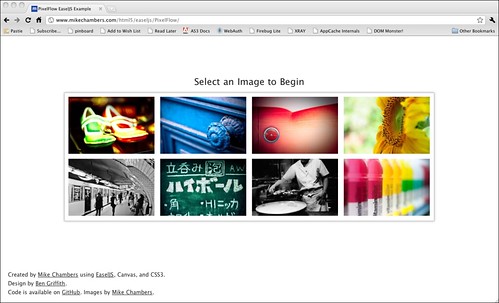
PixelFlow : EaselJS / Canvas Dynamic Graphics Example
If you have happen to have been watching my Flickr feed for the past week or two, you have probably noticed that I have been playing around with creating some graphics using Canvas and EaselJS. What started as a simple EaselJS experiment, quickly morphed into an excuse to build a mini app / example and play around with some of the new HTML5 and CSS3 features.
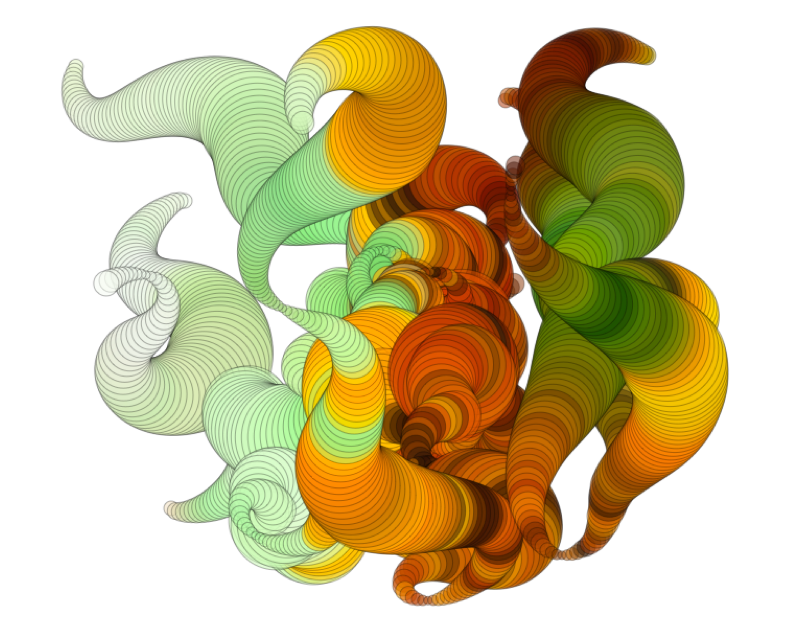
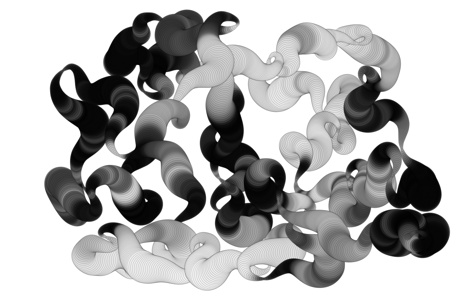
The example I created (named PixelFlow) is a simple example / app that allows you to choose an image, and then create some designs using the colors from the image. The core drawing functionality is built about the HTML5 canvas element and the EaselJS library. It also leverages CSS3 transitions and transformation for animating the UI elements (loading and unloading).
You can play around with the example yourself at:
View PixelFlowI built the example with touch in mind, and thus it has support for touch on Android and iOS devices. Of course, it also works on the desktop using mouse input.
Here is a video showing the example in action:
You can view the video here
As you can see, the multitouch works really well on the iPad.
Huge thanks to Ben Griffith who saved me (and you) from my horrid design skills, and put together a great design for the example.
You can download all of the code from my GitHub repository (released under an MIT License). The code is completely commented, and should be pretty easy to follow.
The example uses the Canvas.toDataURL API to allow you to save and download your creations as a PNG. If you create anything cool, please post a link in the comments.
I have tested the example on the following browsers, all of which should work:
- iPad / iPhone iOS 4
- Android 2.2.2 (Nexus One and Galaxy Tab)
- Firefox 4 on Mac and Windows
- Google Chrome on Mac and Windows
- Apple Safari on Mac and Windows
The example wont work on:
- Firefox 3.6 (doesn’t support CSS Transitions)
- Internet Explorer 8 and below (doesn’t support Canvas)
- Internet Explorer 9 (doesn’t support CSS Transitions)
I could have made changes so IE 9 would work (by removing the reliance on the transitions), but as this was an example to use off some of these features, I decided not to.
There are a couple of known issues:
- You can not save images on Android based devices, as they do not support the Canvas.toDataURL API.
- Rendering is aliased while drawing on Android devices (which looks crappy).Once you stop drawing, everything looks fine.
- Touch does not work on Firefox 4 devices, even if you are on a touch device. I haven’t had a chance to implement the Firefox touch api yet as I haven’t had a touch device with Firefox to test on.
Below are some of the things that I learned while working on this:
Touch support and APIs vary greatly between browsers
Initially the app was mouse based, but I knew that I wanted to enable multitouch for it (at least on the iPad). While it took me some time to find solid docs on the iOS JavaScript multitouch API, once I figured it out I was really surprised by how solid and well designed it was. Indeed, the W3C just released a draft multitouch specification which is based (or inspired by) the iOS API.
Since Safari on iOS is webkit based, I (naively?) expected that the same API would be present on Android based devices. However, I quickly discovered that while the API on Android is similar, it has nowhere near the level of implementation / quality as on iOS. For starters, while the API on Android is multitouch, the browser only supports a single touch point. Worse, if there are multiple touch points, you start getting some weird behavior (i.e. all touchmove events stop broadcasting).
This was frustrating, but I ended up settling on a single touch experience for Android devices (which still works pretty well).
I then realized that the Firefox 4 beta also had support for touch (at least on Windows 7). I didn’t have access to a touch screen on Windows to test though, so I was not able to implement it. However, the Firefox touch API is significantly different than the iOS / Android APIs, and while it looks pretty straight forward, will require some additional detection and code paths in my code to deal with it (adding more complexity).
In general, I don’t think touch support in the browser is there yet. If you can limit your content to just iOS devices, then you can create a very good experience that is relatively easy to develop. However, as soon as you start to support other devices, the complexity and issues dramatically rise.
Canvas Implementations seem pretty solid
With one exception, working with Canvas was pretty painless. I didn’t run into any cross browser issues (although some of those may have been handled by EaselJS) while working with it.
I architected the drawing in my app in a way that performance shouldn’t be a major issue, and it runs fine on both desktop and devices. However, I did have performance issues on the iPad when I added a second overlay canvas, and had to end up removing it when running on touch devices.
I did have a minor hiccup when I realized that when exporting an image from the canvas using canvas.toDataURL, there is no background color. However, after some research into the Canvas API, I was able to work around this in a pretty generic way..
The one major issue I did run into with Canvas was that I discovered that the toDataURL API is not implemented on Android. Because of this, I had to remove the ability to save designs when running on Android. (Apparently this issue is fixed in the Android Honeycomb release).
Of course, Canvas is not supported in any release version of Internet Explorer, but aside from that (and it is a big aside), it worked really well everywhere I tested it.
##CSS Transitions Rock
When you run the example, you will notice that UI elements slide in and out as a transition between views. Initially I was using JavaScript to tween the CSS position properties. This worked fine on the desktop, but was noticeably laggy when running on a device.
I then switched the transitions to use CSS3 Transitions and Transforms which are hardware accelerated on iOS. Frankly, I was blown away by how well they performed (see the video above).
In general, working with the transitions was really easy. I trigger them from JavaScript, and then in some cases, listen for the event when they are done. The biggest issue that I had was that in a couple of instances I needed to chain a number of transitions together which was a bit cumbersome.
Of course, once I tested in other browsers, some complexity was added. In particular, Firefox has different names for the relevant properties and events. They work the same, but it did add some complexity to my code.
Everything that I read online said that in order for the CSS transitions to be hardware accelerated on iOS, you had to explicitly use the transform3d style. However, Apple seems to have updated the browser, as I found that the 2d transform was also accelerated.
Finally, CSS3 transitions work really well if you need to move something and then forget about it until it is done. It doesn’t seem quite as useful though for something like a game, where an item may have to change its trajectory, or other properties while moving.
I did run into an iOS issue where if I referenced an Image element right before it was included in a transition, it would cause the drawing to completely flake out. Once I figured it out, it was easy enough to work around, but, given how new some of this stuff is, you should expect to hit odd issues like this every now and then.
Stability / Quality
In general, I didn’t really run into any major cross browser problems until I began to use some of the new features and APIs. This is to be expected, as some of this stuff is pretty cutting edge, but it is something to keep in mind, especially if you have gotten used to not worrying about cross browser issues because of the maturity of a lot of the JavaScript libraries.
I really like EaselJS
I used the EaselJS library to handle the drawing and canvas management for me, and it worked out really well. It abstracted away a lot of the lower level details of working with the canvas, and allowed me to focus on just creating something neat / fun.
It’s API is similar to the DisplayList API in Flash, which really helped me understand how to model everything.
In addition, I was able to contribute some of the code that I developed for this example, back to EaselJS, which will be included in the next release.
CSS Media Queries really work!
I initially was developing and testing on the desktop and on the iPad. Once I implemented the updated design from Ben, I discovered that it was completely unusable on smaller screens (iPhone and Nexus One). However, in about an hour, I was able to implement a new, small screen style sheet using CSS media queries, and my problem was solved.
It did require a couple of minor changes to the structure of the HTML, but in general, I was surprised by how easy it was to implement / tweak the design for smaller screens.
##The more complex the app became, the more cross browser / platform issues I ran into
I know this is a “no duh!” point, but I think it is important enough to reiterate. It is very easy to build something cool just targeting one browser. However, you will run into issues when you start testing across browser, and those issues will multiply the more complex your content is.
In addition, a lot of the new features are not supported / abstracted away by JavaScript libraries yet, so expect a lot of lower level API implementations when using newer features and APIs (such as touch).
Once some of the implementations settle down, there is an opportunity for existing or new libraries to make this stuff easier, especially around touch and CSS transitions.
Use only as much library as you need
When I first started the project, I was using jQuery as the main DOM library for the app. However, I soon realized that jQuery is pretty large and that I wasn’t using any of the jQuery UI elements. I was particularly concerned about size, as I wanted the example to run well on devices (and load quickly).
I searched around, and ended up settling on xui, which is similar to jQuery. xui, which was built for use in PhoneGap, doesn’t try to do as much as jQuery, and has a strong focus on mobile (where the browser landscape is a bit less varied). Because of this, it is much smaller (around 8kb). It has worked great, although there have been one or two things which jQuery provided that XUI didn’t.
If I needed more UI controls, then I would probably switch back to jQuery, but for this example, xui was perfect.
Performance isn’t just about performance
One final note about performance. A couple of people that I have showed this to have commented that it feels a little slow, especially on the ipad. It is actually running full speed, but I have the graphics draw at a constant rate. This way, it creates nice and smooth lines and color shifts. On the desktop I have added a graphic which shows what the shape is doing, and where it is going. This makes it much clearer what is going on, and seems to shift the perceptions around performance. However, I wasn’t able to add the overlay graphic on the iPad because the second canvas did affect negatively performance. Without the overlay though, the example runs at full speed, but there is a perception that it is running slow.
I think this demonstrates how important UI feedback and responsiveness are important to perceptions around performance. Being able to provide better feedback / UI to the user which indicates what is going on can help improve perceptions around performance.
Anyways, I had a lot of fun working on it, although I am ready to work on some new ideas. Feel free to hack, modify, or do whatever with the code. If you do something cool, or have any questions or suggestions, just post them in the comments.


